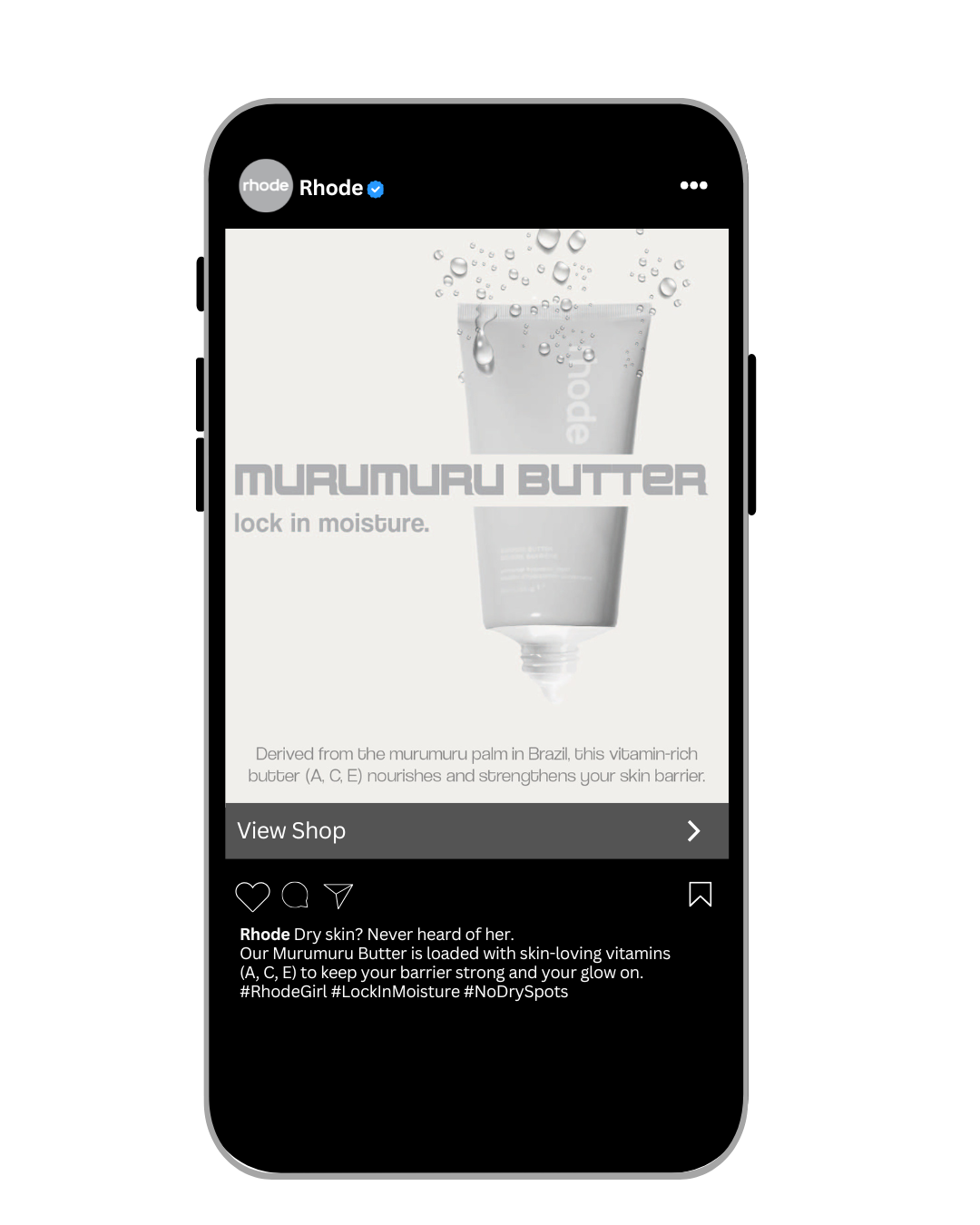
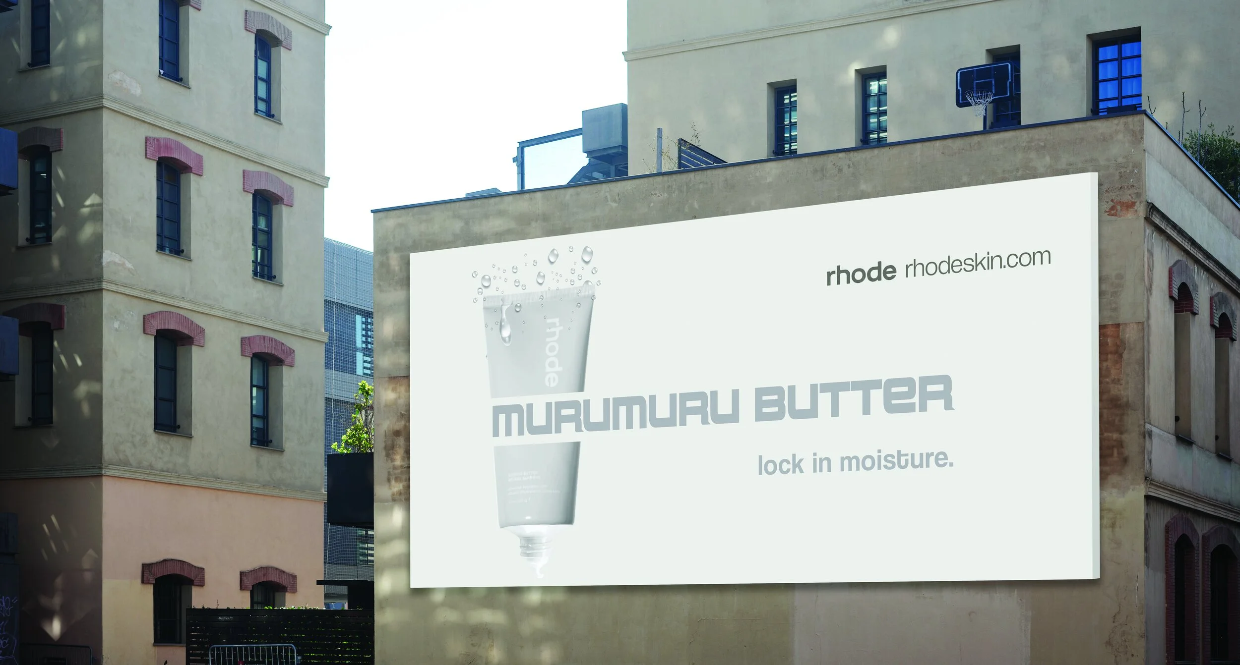
rhode murumuru butter
As a personal exploration in brand refinement, I re imagined Rhode’s Murumuru Butter campaign to align more closely with the brand’s minimalist identity and clearly communicate product benefits. The original design was cluttered and overly technical, which diluted the message and distracted from the product’s value.
The redesigned campaign centers on the benefit of hydration, using a clean monochromatic palette, bold typography, and clear product framing to deliver a focused and elevated message. This shift created a stronger visual hierarchy and clearer call to action, making the campaign more impactful and conversion focused. The redesigned assets including social, out of home, and billboard mock ups feel elevated, intentional, and aligned with Rhode’s modern, skin first aesthetic.